Chart patterns are recurring shapes in price data. They help describe observations such as a trading range, a breakout or a candle with a long wick. They do not tell you with certainty what happens next.
Separate an observation from a trading rule. “Price crossed a previous high” describes something that happened. Turning it into an order also requires context, entry criteria, an exit and position size.
What a candlestick shows
A candle summarises the open, high, low and close of a chosen period. Its body spans the open and close. The wicks extend to the high and low. A five-minute candle and a daily candle can look similar while describing very different periods.
A long lower wick shows that price traded lower during that period and closed away from the low. It does not identify the traders involved or establish that the next candle will rise.
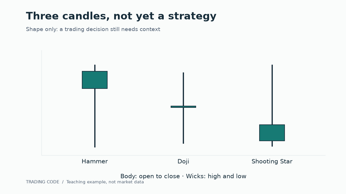
Three familiar candlestick patterns
Hammer
A hammer has a small body near the upper end and a long lower wick. Following a decline, traders may interpret it as possible rejection of lower prices. The same shape in another location can have a different interpretation.
For testing, specify the body-to-wick relationship and the preceding price movement. “It roughly looks like a hammer” invites retrospective selection of convenient examples.
Shooting star
A shooting star has a small body near the lower end and a long upper wick. After a rise, it may suggest rejection of higher prices. It does not establish that the trend has ended: the next candle can still exceed its high.
Doji
A doji has nearly equal opening and closing prices. Its wicks can vary considerably. The immediate observation is simply little net price change during that period. It is not automatically a reversal signal.
Consolidation and breakout
A consolidation is a period when price moves within recognisable boundaries. A reproducible test needs explicit boundary rules, such as the high and low of a fixed observation window.
A breakout rule might use the first crossing, a close outside the range or a subsequent retest. These produce different trades. Choose the definition before evaluating results.
Many strategies use false breakout to describe a crossing followed by a return inside the range. That also needs a time definition: a return after one minute differs from a return the next day.
One chart, two different rules
Imagine an invented range between €99 and €100. Price rises to €100.10, falls to €99.80 and closes the five-minute candle at €99.90.
- Rule A: enter on the first crossing above €100. This rule would have triggered an entry.
- Rule B: enter only after a five-minute close above €100. This rule would not have triggered an entry.
Neither is universally better. Another path might keep rising without returning, making the later confirmation more expensive. The example shows why drawing a formation after the event cannot replace the decision that was available at the time.
Our worked breakout strategy adds the position size, stop, costs and exit to this type of observation.
Other common formations
| Pattern | What it describes | What you still need to define |
|---|---|---|
| Double top / double bottom | Two highs or lows around a similar price | Separation, tolerance and confirmation point |
| Triangle | A narrowing trading range | Which highs and lows count and when the pattern ends |
| Flag | A short counter-move after a strong impulse | What qualifies as an impulse and an acceptable correction |
| Outside candle | A high above and low below the preceding candle | Closing price, context and exit rule |
These shapes are not exclusive to shares. Products, data feeds and session boundaries can nevertheless produce different candles. Your broker's chart need not match another provider's chart exactly.
Timeframes and volume
Fix the timeframe for your decision first. Switching to another timeframe simply because a trade is losing changes the rules while the position is open.
Volume may add context, for example whether activity exceeds that of a comparison period. Understand what is measured: exchange volume from a particular venue and broker-specific tick volume are not equivalent. A larger volume bar proves neither the next price direction nor a profitable strategy.
Your chart checklist
- Has the relevant candle or observation period finished?
- Does the pattern meet a definition written in advance?
- Are the instrument, session and data source clear?
- Is there an explicit entry trigger?
- What invalidates the idea, and what is the planned loss?
- Have costs and adverse execution been allowed for?
- Have comparable failed signals been recorded too?
Combine this with the general trading checklist. Do not collect only attractive examples: a fair comparison also needs cases where the pattern was visible and the trade still lost.
Continue learning
Start with one formation and translate it into testable rules. CME Group's technical-analysis introduction offers further background. For the next practical step, use our strategy comparison. The Trading Code book provides a structured route through the wider subject.